Tesdopi - Design to inspire learning
Introduction
Tesdopi is a digital product owned by Edemy, with the mission to make formal learning more engaging and fun. Before I was engaged, the social enterprise already launched Tesdopi 1.0 as a simple proof of concept.
I led the design of Tesdopi 2.0 as a consultant 2 years ago, helping the social enterprise to increase their revenue stream , and grow their monthly active users by well over well over 120% and total user base by 300% within the first 3 months of the official launch of the new design.
Role
Product designer (execute end-to-end UX and UI)
Timeline
Oct 2019 - Jan 2020
Tools
Invision Studio
Sketch
Adobe Suite (Illustrator, Photoshop, After Effects)
Goals
Tesdopi 1.0 had a small yet strong fanbase that regularly gave feedback when the question was wrong or if there were bugs. As their user base grows, it was only natural that Tesdopi 1.0 need a redesign to scale the app in order to
Improve its usability issues
Add more value to the users, and accommodate more use-cases and move closer to their vision of making learning fun for high school students using their research-driven and pedagogy-focused method.
Add a subscription model as a source of revenue to sustain the business

Tesdopi 1.0 (before the redesign)
The Deep Learning Loop
The success of Tesdopi lies in our ability to make our users or customers get better at studying, not just better at the subject matter. Deep learning path is the core of the product; it is the habit building loop that involves around
Users making "investment" to follow the study path of learning and taking capacity tests after each lesson.
The app provides "feedback" letting the users know if they really understand the content as scores and grades.
Users set study goals, and see their progress visually, which motivates them to complete their goals.
Users also get coins as a "reward" for all their "actions" and all the "investments" made within the app.
The users then see their performance (scores) compared to their peers—a gamification element and social cue that further motivate and incentivize the users to keep coming back.
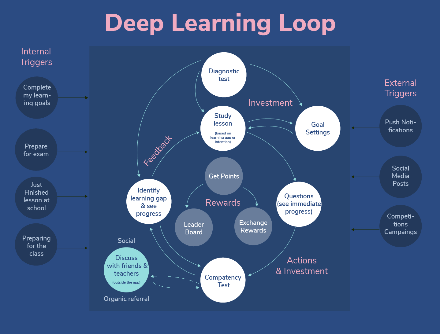
This was inspired by the Hook Model by Nir Eyal as well as the Learning Loop from Amy Jo Kim's Game Thinking.
In addition to the exponential growth of user base, MAU, and paid users, it is super exciting to start seeing the growth of superusers — those who use the app every day on an average of 1h/day. The data tells us that we are moving closer to making Tesdopi part of the student's habit and is on the path to making formal learning fun for them.
The team has shared with me insights on the first 3 months of Tesdopi 2.0
⭐️ Total users growth over 300% ( 60K+ users)
⭐️ Monthly active user growth: over 120%
Final Thoughts
It is a rare opportunity to work on a visionary product, but a rarer opportunity to work with a team that is so passionate about the mission, and would go out and beyond to provide value to their users. I learned a lot about education and teaching methodology from the team.
Writing case studies, allow me to look back at my work, think through the process I did, and most important find out what I could have done better. And here are a few things:
More research into existing products and competitor landscape. We took a lot of inspiration from amazing apps like Duolingo and Khanhan Academy with its gamification, and habit-forming behavior. While the language could be a challenge (because some of the students only speak Khmer), seeing these products already existed, I could have done usability testing with these products just to see what users really like and what doesn't work. This could really speed up the ideation process and could unearth interesting insights.
Visual's hierarchy and the paradox of choice. In my attempt to make the product fun visually ( to compensate for the seriousness of the subject matter) has probably led to the overuse of bright colors and hence could result in visual overload. My usability testing was lacking some context as the users during the test only interacted with the products a couple of times. So, the first impression was amazing. Have I test it in context, however, I would probably find out that if the user opens the app every day and study a long period of time, the colorful interface may not work well.

A small attempt to enhance the UI on some of the areas mentioned.
✨ Thank you for reading ✨
Check out my other case studies below