
Case Study: Design to Inspire Learning - Tesdopi
Introduction
Tesdopi is a digital product owned by Edemy, with the mission to make formal learning more engaging and fun. Before I was engaged, the social enterprise already launched Tesdopi 1.0 as a simple proof of concept.
I led the design of Tesdopi 2.0 as a consultant, helping the social enterprise to increase their revenue stream , and grow their monthly active users by well over well over 120% and total user base by 300% within the first 3 months of the official launch of the new design. We also see a good retention and stickiness as Tesdopi students completed a total of 1.06M lessons and 0.8M exercises.
Role
Product designer (execute end-to-end UX and UI)
Timeline
Oct 2019 - Jan 2020
Tools
Invision Studio
Sketch
Adobe Suite (Illustrator, Photoshop, After Effects)
[Disclaimer] The design and content in this case study are based on my understanding of the product, and do not 100% reflect the actual app or business. The prototypes have also been translated into English.
Goals
Tesdopi 1.0 had a small yet strong fanbase that regularly gave feedback when the question was wrong or if there were bugs. As their user base grows, it was only natural that Tesdopi 1.0 need a redesign to scale the app in order to
Improve its usability issues
Add more value to the users, and accommodate more use-cases and move closer to their vision of making learning fun for high school students using their research-driven and pedagogy-focused method.
Add a subscription model as a source of revenue to sustain the business

Tesdopi 1.0 (before the redesign)
Project Approach - the Double Diamonds
I was grateful that Tesdopi team is very open to human-centric design. This was how I approach the project in a nutshell, of course, there are a lot of loops and iterations in between.
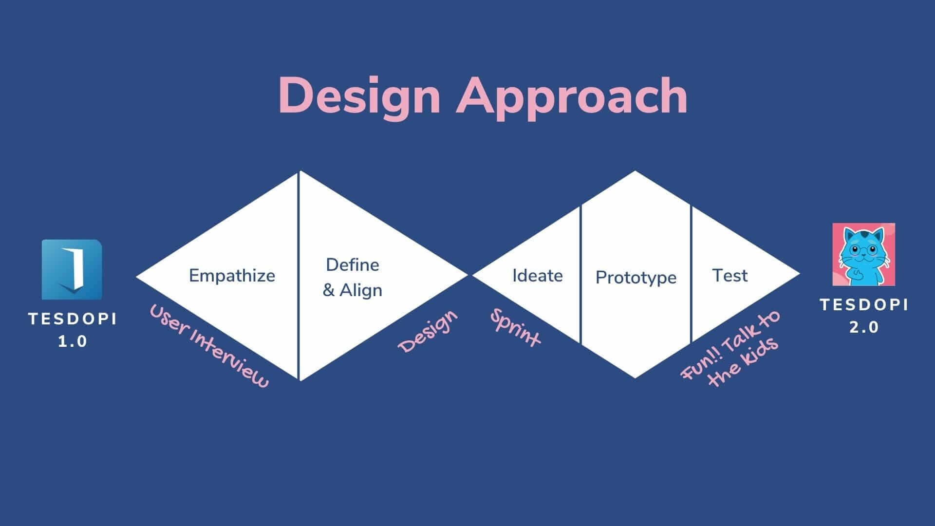
This is of course my attempt to simplify the process but it was a lot more messy than this.
Empathize & Define
To understand the current stage of the products its usability issues, I did a couple of rounds of interviews and usability testings with the existing users and general high school students.
Key Insights
High school students are super busy, attending multiple extra classes and private tutoring sessions to make sure they cover all the bases for what potentially show up in their national exams.
These lessons can be very expensive and not very effective ( students are restless by the time they go to their extra classes and the class size can be up to 100+ students)
They have low tolerant to mistakes and would likely give up if they get a lot of wrong answers
They constantly look for good resources and are using their smartphone to help them.
Content is key
Persona
From the insights of the existing users as well as interviews with potential customers, TesDopi 2.0's user's personas are formed.


Job Stories
Below are a few job stories I defined early on for Tesdopi 2.0. I also look at what are the other products the students are currently using to do the same Job.

Ideations
Time to synthesize information and ideate solutions! I ran 1.5 days of Design Sprint with the team on weekends. It was fun, productive, and super-intensive (no kidding yeah...). It was a very important step for us to get alignment on the findings, problem space, the business goals and start sketching the solutions. The prototyping and testing component is not part of this design sprint.


Please excuse my bad photography skill 😅 it was intensive.
First-time users vs. Regulars
We understand that the users will hire our products for different jobs, as determined earlier by the personas and job stories. Therefore, it is very important for us to think that through the different levels of the users as well. Are they just a visitor or are they regular? Are they hiring the product to improve their understanding of the lessons at school? Or they are just trying to optimize their free time, and not missing out on new materials?

The Deep Learning Loop
The success of Tesdopi lies in our ability to make our users or customers get better at studying, not just better at the subject matter. Deep learning path is the core of the product; it is the habit building loop that involves around
Users making "investment" to follow the study path of learning and taking capacity tests after each lesson.
The app provides "feedback" letting the users know if they really understand the content as scores and grades.
Users set study goals, and see their progress visually, which motivates them to complete their goals.
Users also get coins as a "reward" for all their "actions" and all the "investments" made within the app.
The users then see their performance (scores) compared to their peers—a gamification element and social cue that further motivate and incentivize the users to keep coming back.
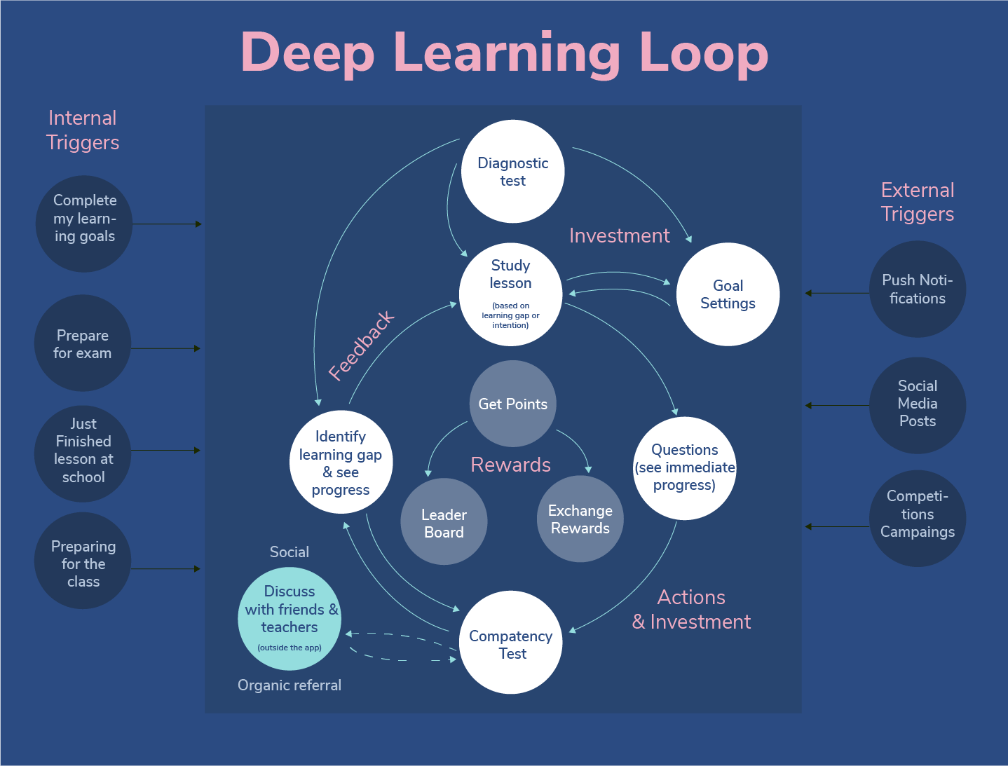
This was inspired by the Hook Model by Nir Eyal as well as the Learning Loop from Amy Jo Kim's Game Thinking.

We want to make the learning experience both informative and interactive. The content formats are diverse (image, text, video). We added a fun short question at the end of each session. The question allows the student to quickly check their understanding of the topic and also serves as a summary of the session.
Design to reflect the content
Content is the key. We know the variety of questions and test format make the learning experience through Tesdopi more effective, engaging, and reflective of the exams in real life. So the UIs were designed to accommodate all these.

The user should take competency quizzes at the end of each chapter. User will see their result at the end and they can see the solution and answer to the questions they have done wrong and can retake just the wrong questions.

User takes the exam paper (like a mock test). The flow here is to try to mimic the exam paper as much as possible, with the combination of multiple-choice and free input text while being limited to the size of the phone screen. For exam flow, there is also a count-down clock to really reflect the actual exam.
Adding Fun and Humanizing the experience
Inspired by Duolingo's gamification and friendliness, we also decided to have a character of our own. I designed the cat and give it some personality but mainly try to keep the character simple and can be easily modified to express multiple emotions and be friendly for simple animation.


(Testings + Iterations) x a lot
I did multiple rounds of testing and prototyping along the way to refine the product. In addition to testing the prototype, I also attempted to test the desirability of the product as well in addition to some of the paid models we thought of.

" This is totally different."
"So much fun!"
"Never seen such an engaging fun learning app. I love this!"
Tesdopi 2.0

Tesdopi in Google Playstore and is also available in Appstore as well.
In the process of writing this case study, I did check back in with Tesdopi team and see how the product is going as well as for their feedbacks.
In addition to the exponential growth of user base, MAU, and paid users, it is super exciting to start seeing the growth of superusers — those who use the app every day on an average of 1h/day. The data tells us that we are moving closer to making Tesdopi part of the student's habit and is on the path to making formal learning fun for them.
The team has shared with me insights on the first 3 months of Tesdopi 2.0
Updated as of end of 2021


Final Thoughts
It is a rare opportunity to work on a visionary product, but a rarer opportunity to work with a team that is so passionate about the mission, and would go out and beyond to provide value to their users. I learned a lot about education and teaching methodology from the team.

Good words from the CEO herself

Writing case studies, allow me to look back at my work, think through the process I did, and most important find out what I could have done better. And here are a few things:
More research into existing products and competitor landscape. We took a lot of inspiration from amazing apps like Duolingo and Khanhan Academy with its gamification, and habit-forming behavior. While the language could be a challenge (because some of the students only speak Khmer), seeing these products already existed, I could have done usability testing with these products just to see what users really like and what doesn't work. This could really speed up the ideation process and could unearth interesting insights.
Visual's hierarchy and the paradox of choice. In my attempt to make the product fun visually ( to compensate for the seriousness of the subject matter) has probably led to the overuse of bright colors and hence could result in visual overload. My usability testing was lacking some context as the users during the test only interacted with the products a couple of times. So, the first impression was amazing. Have I test it in context, however, I would probably find out that if the user opens the app every day and study a long period of time, the colorful interface may not work well.

A small attempt to enhance the UI on some of the areas mentioned.
✨ Thank you for reading ✨
Check out my reflection of designing a delightful UX for an MVP product, balancing experience and all the technical constraints and timeline.

The product Playgame Unlimited is a part of Cellcard’s attempt to reach the youth segments. It is not just a data plan but also a membership plan for gamers that is designed to leverage and include some of the main aspects of a gamer’s lifestyle.
