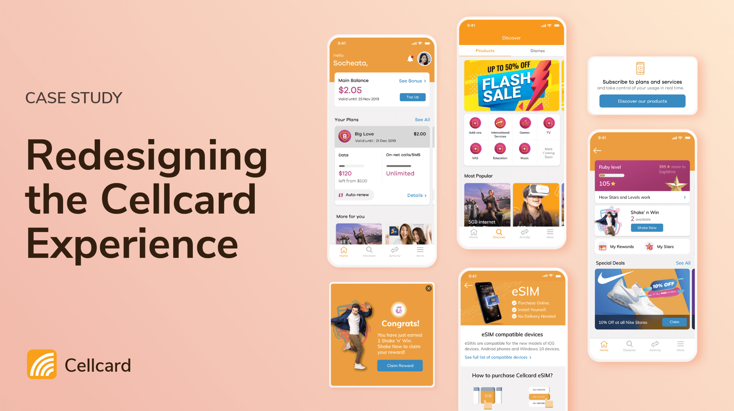
Case Study: Redesigning the Cellcard Experience
Introduction
Cellcard is the first and one of the three biggest Telecom companies in Cambodia 🇰🇭 and the only Cambodian's own. Cellcard app encompasses all the main aspects of the business. Before I joined, Cellcard already launched the self-servicing app, however, the product falls short in meeting the customers' expectations and wasn't designed to scale.
I was the only designer working on the redesign of the Cellcard App and led the execution from end to end. The redesign led to a 70% increase in the number of registered users, 57% growth in active monthly users, and all transaction-type journeys have well over 30% conversion rate.
Role
The only product designer, design and execute end-to-end UX and UI.
Acting QA ( because we didn't have enough resources for a few months)
Timeline
Dec 2019 - Jan 2021
(The redesign was first launched in April 2020)
Tools
Sketch & Figma
Invision Studio
Adobe Suite (Illustrator, Photoshop, After Effects)
[Disclaimer] I have omitted and obfuscated confidential information in this case study. All information in this case study is my own and does not necessarily reflect the views of Cellcard.
Key Pain-points with the Existing Design
I did a series of usability and desirability tests on the old app in order to validate some of the initial hypothesized issues and discovered other pain-points. I also tested our competitor app with the users as well.

1. Confusing Navigation
The app had both the bottom navigation bar and the hamburger menu (navigation drawer). The two navigation systems appeared to be of the same level yet are not talking to each other. When users navigate the pages through the drawer, there is no indication of what bottom navigation the page is on.
2. Fragmented User-Experience
All major journeys, especially transaction-type journeys within the app relied on SMS as feedbacks. Users wouldn't know if their subscription is successful or fail.
3. Unfriendly and inconsistent look & Feel
The font and colors used in the app were too small and not legible to the users. There were also not many branding elements to the app as well.

Previous deisgn
Why the revamp?
Cellcard App started out as a self-servicing app, with its focus on self-servicing, positioning itself as an additional channel to USSD and IVR.
The redesign aims to change that positioning:
Resolve all the existing user-experiences pain-points
Improve Engagement & Net Revenue: creating avenues beyond self-servicing to include digital lifestyle products and services
Improve Acquisition & Market Share: providing seamless digital experience in becoming Cellcard subscribers
Build Digital Stickiness: conversion of existing traditional users to digital.
Improve Customer Relationship
Design Principles
Hand-holding
Step-by-step user-journey: one action per page, not to overwhelm the users
Clear communication, simple language
Error-prevention & handling
Empowering & Transparency
Consistent feedback on what going on: status
Build trust: Telecom in Cambodia, in general, is not well trusted by customers, due to a lack of transparency or layers of barriers to relevant information regarding charging rates or expiration dates.
Consistent, Fun & On Brand
Consistent use of call to action
Cellcard was a premium brand → need to capture the young audience
Visually fun
Solution

Registration Flow
The registration process is simplified both in the information collected and also the experience. Using step-by-step flow we were able to hand-hold users throughout the process, handling all the user errors one by one, and allow users to focus on the specific questions and answers. The accuracy of their answers is very important as we are trying to bridge the data gap in customer KYC.

Subscription Flow
On average, users do a 3.2x subscriptions each (not including the auto-renewals) on the app
The redesign and enhancement of the subscription flow are along with an enhancement of our billing systems. The goal is to transparently communicate the value of each product, compared to similar ones within the same package, the validity dates, and auto-renew option (which was a new introduction to our Telco products)

Recurring Top-ups

We found out after the launch that most drop-offs happen at the payment methods. This was due to not having the desired choice for the users to pay, and the user experience of each payment method has a lot of friction with layers and layers of security and authentication.
Understanding these drop-off points and the customer behavior of regular topping-up, we came up with the recurring top-up solution, allowing users to set up how frequent they want to top-up, how much, and from which source of fund. This reduces the friction of going through the payment gateways and also helps customers automate their top-up. The frequency options of the top-up tight directly to the validity duration of our subscriptions ( 7 days and 30 days)

Cellcard Club
Cellcard Club — our loyalty program is one of the most widely visited features within Cellcard App due to its reward and our aggressive marketing campaign, but it had a relatively high drop-off rate due to its user experience.
Design goals:
Onboarding: as users need to sign up to join the program, they need to see the value of this free loyalty program they are getting as part of being Cellcard customers.
Education: nature of gamification is engaging, rewarding but also challenging. The challenging aspects present friction and complexity, which requires some education.
Transparency: communicates clearly how their stars work, earning dates and expiration dates, how they can redeem their prizes, and the status of their prizes
Experience: improve the user journey and making the engagement delightful.
Nudges: improve contextual notifications when users have unused chance to win prizes or if their stars are about to expire

Rollout (with known bugs)
The first rollout of the redesign was just 4 months after the project officially started ( both design and development).
The redesign was rolled out in different chunks, solving first the main flows that really impact the experience and transaction, such as the homepage, top-up, and subscribe flow. To prevent the look and feel from being too conflicting between the redesign and the old UI, we unified the headers and CTAs on all pages as a start.

Issues after the redesign
Soon after we launched the redesign, we found out that we have just solved the tip of the iceberg.
Information Architecture of the app. A lot of features, growing fast but wasn't optimizing for performance
Technical Constraints
While resolving the issues, we had to come up with some quick wins, and one of them is a specially designed Under Maintenance page, that allows our customers to perform some basic self-service when the app undergoes maintenance, which was unfortunately quite often in the early days. This is not an ideal experience, but it prevented further damage to customer experience.

Unfortunately, there was a time when the system errors and the app was down for a long while
Another Redesign - the new Homepage
The homepage with the dashboard updated in real-time was really slowing the app loading time. And with the new use cases involving lifestyle and financial elements we aspired to include, the homepage we launched 6 months ago needs another enhancement.

Final Thoughts
The Cellcard App touches the main aspects of Cellcard business, which means the success of the product lies in close cross-functional collaboration among all relevant departments and stakeholders. It was an amazing learning journey to embed myself within the business and advocate for great customer experience while balancing the business needs and technical constraints. As the core team was very small, I was able to wear many heads, learning a lot from our PO, BA, PM, and all the amazing developers.
💖Shout out to Arvindd, Almaz, Bong Sambo and everyone who have made it happened!

Some of the super heroes are not seen here as we work remotely most of the time
✨ Thank you for reading ✨
Check out how I designed to make formal learning fun for a secondary and high school students in Cambodia 🇰🇭
